A Gentle Introduction to Finance using R: Efficient Frontier and CAPM - Part 1
The following entry explains a basic principle of finance, the so-called efficient frontier and thus serves as a gentle introduction into one area of finance: “portfolio theory” using R. A second part will then concentrate on the Capital-Asset-Pricing-Method (CAPM) and its assumptions, implications and drawbacks.
Note: All code that is needed for the simulations, data manipulation, and plots that is not explicitly shown in this blogpost can be found on my Github page.
Introduction
One of the basic concepts of finance is the risk-return tradeoff. As an illustrative example: If I were to offer you two investments with the same risk but with different expected returns, you would take the investment with the higher return (a closer look on what is meant by the terms risk and expected return follows later). If the two investments had the same expected return but different levels of risk, most people would choose the investment with less risk. This behaviour is called risk-aversion.
But what happens if you have to make the decision between a strategy of how to distribute an investment worth of $100.000 between the 30 companies listed in the the German DAX index, the 100 companies from Britain’s FTSE, the 500 companies from the S&P 500, or if you have the (most realistic) option to invest in all listed stocks in the world? How would you distribute the cash to create a promising portfolio?
This is the question Markowitz tried to answer in 1952 in his paper “Portfolio Selection”. Now, many years later, many academics and practitioners have added their answers to the discussion, advancing the discussion, but Markowitz’s solution is still considered to be a fundamental piece of finance. His portfolio selection advanced into the now called “Capital Asset Pricing Model” or short CAPM. The R/Finance conference 2016 alone lists at least 4 entries that are directly linked to portfolio theory and the CAPM. So what exactly is the CAPM doing, what are its implications, assumptions, what are its drawbacks, and for us most importantly, how can we leverage R to calculate it?
Let’s create a hands-on example to illustrate the theory:
We begin by looking at three different, well-known stocks of the Dow-Jones Industrial Average: IBM (IBM), Google/Alphabet (GOOG), and JP Morgan (JPM).
I have gathered monthly data since 2000 from Yahoo using the quantmod-library and saved it to my Github-page (including the script to gather the data).
We can load the data and plot an indexed price with the following code (notice, I use data.table for data storage and manipulation, but of course you can use dplyr, or base-r as well)
library(data.table)
library(scales)
library(ggplot2)

link <- "https://raw.githubusercontent.com/DavZim/Efficient_Frontier/master/data/fin_data.csv"
dt <- fread(link)
dt[, date := as.Date(date)]

# create indexed values
dt[, idx_price := price/price[1], by = ticker]

# plot the indexed values
ggplot(dt, aes(x = date, y = idx_price, color = ticker)) +
  geom_line() +
  # Miscellaneous Formatting
  theme_bw() + ggtitle("Price Developments") +
  xlab("Date") + ylab("Price\n(Indexed 2000 = 1)") +
  scale_color_discrete(name = "Company")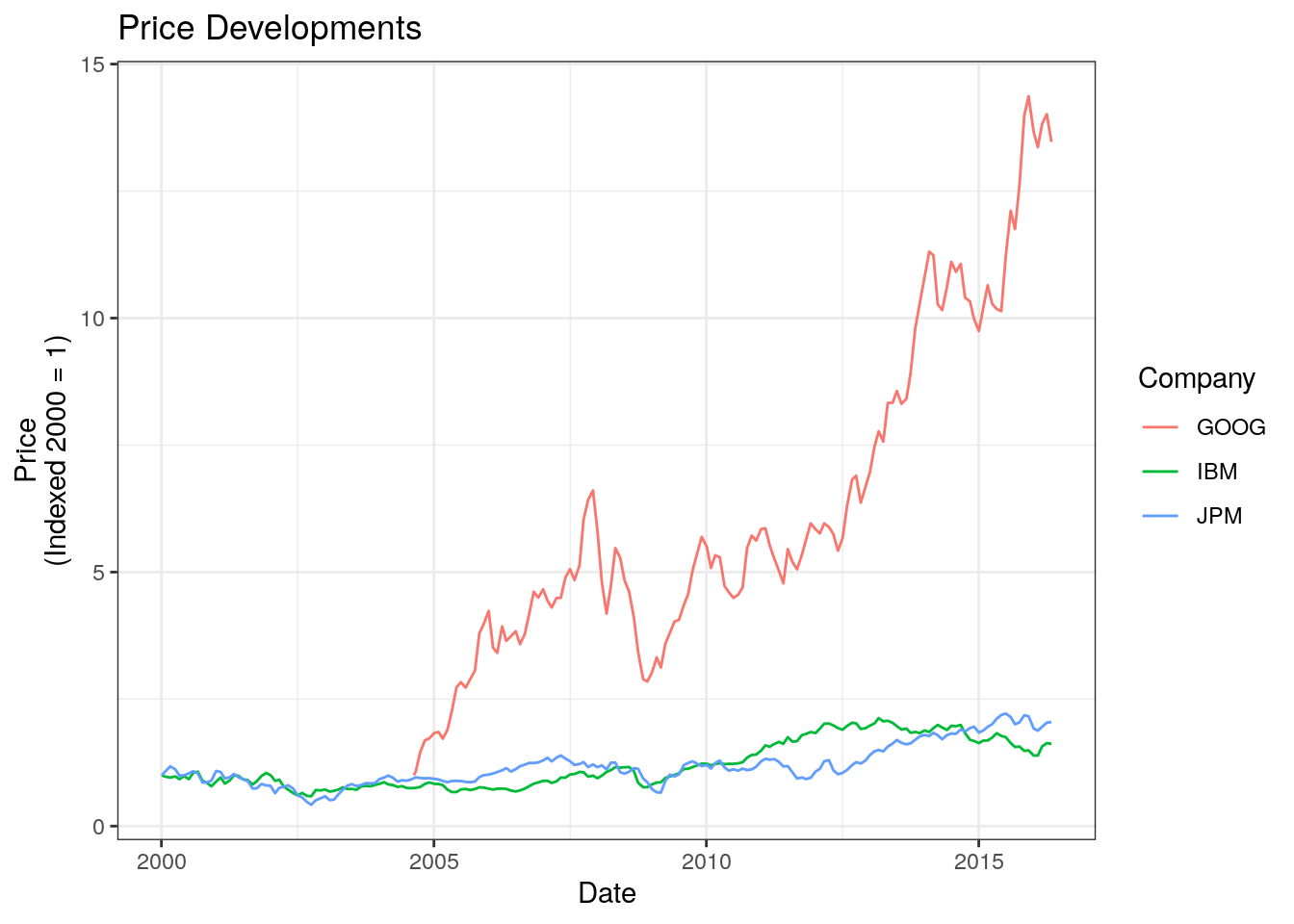
Altough we can see that Google outperformed the other two, we can also see that it seems it was risikier to invest in Google, as shown by the large spikes and drawdowns. This is the principle of risk-return tradeoff that is fundamental to the CAPM. Usually, risk is defined as volatility, which is defined as the standard deviation of the returns . On the other hand, return is either calculated using arithmetic or logarithmic returns (for simplicity I use arithmetic returns in this post, more on the mathematics of returns can be found in the appendix of this post). To visualise the tradeoff, we can compute the mean and standard deviation for returns in a table or plot the two measures against each other.
# calculate the arithmetic returns
dt[, ret := price / shift(price, 1) - 1, by = ticker]

# summary table
# take only non-na values
tab <- dt[!is.na(ret), .(ticker, ret)]

# calculate the expected returns (historical mean of returns) and
# volatility (standard deviation of returns)
tab <- tab[, .(er = round(mean(ret), 4),
               sd = round(sd(ret), 4)),
           by = "ticker"]
tab
## ticker er sd
## 1: IBM 0.0040 0.0554
## 2: GOOG 0.0217 0.0801
## 3: JPM 0.0064 0.0741The table tab shows that Google had the highest expected return and also the highest volatility, whereas IBM had the lowest figures, both in terms of expected returns and volatility.
| Ticker | Expected Return | Volatility |
|---|---|---|
| IBM | 0.41% | 5.55% |
| GOOG | 2.21% | 8.03% |
| JPM | 0.64% | 7.43% |
One visualisation you will have with no doubt already come across if you know a bit about the CAPM is a plot regarding this risk-return tradeoff, with the risk (volatility) on the x-axis, the expected returns on the y-axis and dots for each asset/company. In our example it looks like this.
ggplot(tab, aes(x = sd, y = er, color = ticker)) +
  geom_point(size = 5) +
  # Miscellaneous Formatting
  theme_bw() + ggtitle("Risk-Return Tradeoff") +
  xlab("Volatility") + ylab("Expected Returns") +
  scale_y_continuous(label = percent, limits = c(0, 0.03)) +
  scale_x_continuous(label = percent, limits = c(0, 0.1))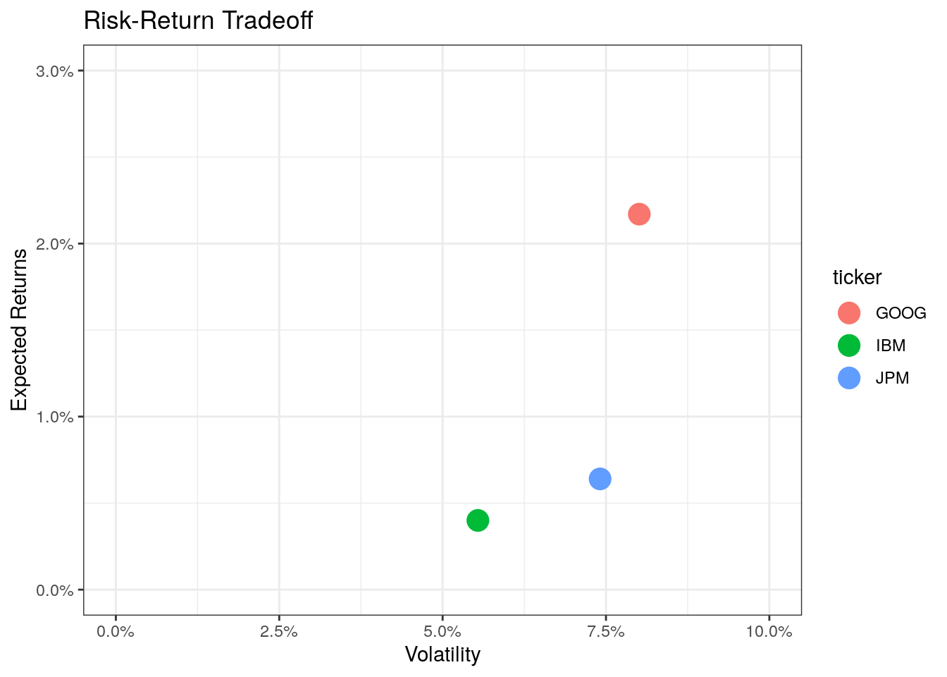
Given that you had to take only a single stock and given past performance indicates future performance (more on the assumptions later, but for now: historic performances almost never indicates future performances), you would probably choose Google as your best investment choice. However, the exclusive option is not realistic as there is something called diversification and you can reduce risk by buying multiple stocks.
Coming back to the examples from the beginning: If you had the choice between three fictive investments A (expected return of 5%, volatility of 4%), B (exp ret of 5%, volatility of 5%), or C (exp ret 6%, volatility of 5%), you would prefer A over B (we say A is efficient to B) as it has less volatility, and C over B as it has a higher expected return. However, we cannot compare A and C withouth further knowledge. In summary, the higher a point on the graph is to the left, the more favorable an asset is (higher expected return and less volatility).

If we combine assets into a new portfolio that contains stocks from two companies, our portfolio also has an expected risk-return tradeoff. The crux is to calculate these values for a given set of (multiple) assets and find an optimum portfolio. This is what we will do next. We will start with just two assets to show the main principles, then we will add a third asset to show how to find the so-called efficient frontier, lastly we will look into different options and constraints when calculating the efficient frontier.
Calculating the Risk-Return Tradeoff of a Portfolio
Two Assets
Given a portfolio consisting of two assets with a share of stock x of \(\omega_x\) and a share of stock y of \(\omega_y = 1 - \omega_x\) (as we invest all of the cash, we get the constraint that the weights add up to one, so that \(0 \leq \omega_x \leq 1\), \(0 \leq \omega_y \leq 1\), and \(\omega_x + \omega_y = 1\)). Take an equally weighted portfolio as an example, where stock x (say Google) makes 50% of the portfolio (\(\omega_x = 0.5\)) and stock y (i.e., IBM) makes up for the other 50% of the value (\(\omega_y = 1 - \omega_x = 0.5\)). What are the expected returns and volatility of the portfolio containing the two assets? Is it a direct linear combination of the two? Not necessarily. The expected values are a function of the correlation \(\rho\) between the returns of the assets. If the returns are perfectly correlated (\(\rho = 1\)), a portfolio would lie on this line, however, the returns are most likely not perfectly correlated. The next plot shows the possible values a portfolio will take between two simulated return series given a certain correlation, the maths behind calculating this will be explained in a bit).

We see that the lower the correlation between two stocks is, the better it is for diversification purposes (remember usuallyy higher expected return (up) and lower volatility (left) is better). In the case of a perfect negative correlation (\(\rho = - 1\)) we could diversify all risk away (of course, reality has most likely no cases where two assets have a perfect positive or negative correlation).
To calculate the expected return \(\hat{r}_p\) and the expected volatility \(\sigma_p\) of a portfolio, we need to use the following formulae, wich include the weights \(\omega\) for asset x and y, the expected returns \(\hat{r}\), the expected risk \(\sigma\) (standard deviations), as well as the covariance \(\sigma_{x,y}\) (which is closely related to the correlation) for the two stocks.
We get the expected return for the portfolio with
\[ \hat{r}_p = \omega_x \hat{r}_x+ \omega_y \hat{r}_y \]
and the expected volatility with
\[ \sigma_p = \sqrt{\omega_x^2 \sigma_x^2 + \omega_y^2 \sigma_y^2 + 2 \omega_x \omega_y \sigma_{x,y}} \]
Given that the correlation between two series can be expressed as a product of their covariance and their respective standard deviations (\(\sigma_{x,y} = \rho_{x,y} \sigma_x \sigma_y\)), we can see why the portfolio is relying on the correlation between the inputs.
I simulated returns for multiple assets already (the code can be obtained here: create_multiple_asset_dataset.R). Using the maths we can calculate the expected return and volatility for a portfolio for given shares. As we want to see how good our portfolio is, we calculate not one, but many possible portfolios that have a share of \(0\leq \omega_x \leq 1\) (Given that we cannot borrow money, we have the restriction \(\omega_x + \omega_y = 1\), thus we only have \(\omega_x\) as a variable and not \(\omega_y\)). First we have to load the returns, then we calculate the necessary values, in the last step we calculate the expected values for the portfolio.
# load the data
link <- "https://raw.githubusercontent.com/DavZim/Efficient_Frontier/master/data/mult_assets.csv"
mult_assets <- fread(link)

# calculate the necessary values:
# I) expected returns for the two assets
er_x <- mean(mult_assets$x)
er_y <- mean(mult_assets$y)

# II) risk (standard deviation) as a risk measure
sd_x <- sd(mult_assets$x)
sd_y <- sd(mult_assets$y)

# III) covariance
cov_xy <- cov(mult_assets$x, mult_assets$y)

# create 1000 portfolio weights (omegas)
x_weights <- seq(from = 0, to = 1, length.out = 1000)

# create a data.table that contains the weights for the two assets
two_assets <- data.table(wx = x_weights,
                         wy = 1 - x_weights)

# calculate the expected returns and standard deviations for the
# 1000 possible portfolios
two_assets[, ':=' (er_p = wx * er_x + wy * er_y,
                   sd_p = sqrt(wx^2 * sd_x^2 +
                                 wy^2 * sd_y^2 +
                                 2 * wx * (1 - wx) * cov_xy))]
two_assets
## wx wy er_p sd_p
## 1: 0.000000000 1.000000000 0.03000000 0.01973497
## 2: 0.001001001 0.998998999 0.03004001 0.01971606
## 3: 0.002002002 0.997997998 0.03008001 0.01969728
## 4: 0.003003003 0.996996997 0.03012002 0.01967863
## 5: 0.004004004 0.995995996 0.03016002 0.01966010
## ---
## 996: 0.995995996 0.004004004 0.06980549 0.04979363
## 997: 0.996996997 0.003003003 0.06984550 0.04984333
## 998: 0.997997998 0.002002002 0.06988550 0.04989305
## 999: 0.998998999 0.001001001 0.06992551 0.04994277
## 1000: 1.000000000 0.000000000 0.06996551 0.04999250# lastly plot the values
ggplot() +
geom_point(data = two_assets, aes(x = sd_p, y = er_p, color = wx)) +
geom_point(data = data.table(sd = c(sd_x, sd_y), mean = c(er_x, er_y)),
aes(x = sd, y = mean), color = "red", size = 3, shape = 18) +
# Miscellaneous Formatting
theme_bw() + ggtitle("Possible Portfolios with Two Risky Assets") +
xlab("Volatility") + ylab("Expected Returns") +
scale_y_continuous(label = percent,
limits = c(0, max(two_assets$er_p) * 1.2)) +
scale_x_continuous(label = percent,
limits = c(0, max(two_assets$sd_p) * 1.2)) +
scale_color_continuous(name = expression(omega[x]), labels = percent)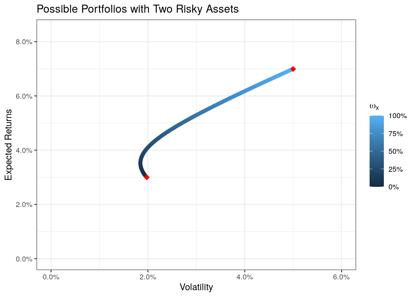
With the color coding we can see that the upper point stands for stock x (\(\omega_x = 100%\)) and the lower point stands for stock y (\(\omega_x = 0%\), thus \(\omega_y = 100%\)). We also see that all possible portfolios lay on a curve. That means the line stands for all possible portfolios combining the two assets. This will change if we add a third asset.
Adding a Third Asset
Adding a third asset to the portfolio expands the formula. For the portfolio we get an expected return of
\[ \hat{r}_p = \omega_x \hat{r}_x + \omega_y \hat{r}_y + \omega_z \hat{r}_z \] and an expected standard deviation of
\[ \sigma_p = \sqrt{\omega_x^2 \sigma_x^2 + \omega_y^2 \sigma_y^2 + \omega_z^2 \sigma_z^2 + 2 \omega_x \omega_y \sigma_{x,y} + 2 \omega_x \omega_z \sigma_{x,z} + 2 \omega_y \omega_z \sigma_{y,z}}. \]
Doing this in R is fairly easy once you understand the last code-chunk for two assets. By expanding it we get the following
# calculate the necessary values:
# I) expected returns for the two assets
er_x <- mean(mult_assets$x)
er_y <- mean(mult_assets$y)
er_z <- mean(mult_assets$z)

# II) risk (standard deviation) as a risk measure
sd_x <- sd(mult_assets$x)
sd_y <- sd(mult_assets$y)
sd_z <- sd(mult_assets$z)

# III) covariance
cov_xy <- cov(mult_assets$x, mult_assets$y)
cov_xz <- cov(mult_assets$x, mult_assets$z)
cov_yz <- cov(mult_assets$y, mult_assets$z)

# create portfolio weights (omegas)
x_weights <- seq(from = 0, to = 1, length.out = 1000)

# create a data.table that contains the weights for the three assets
three_assets <- data.table(wx = rep(x_weights, each = length(x_weights)),
                           wy = rep(x_weights, length(x_weights)))

three_assets[, wz := 1 - wx - wy]


# calculate the expected returns and standard deviations for the 1000 possible portfolios
three_assets[, ':=' (er_p = wx * er_x + wy * er_y + wz * er_z,
                     sd_p = sqrt(wx^2 * sd_x^2 +
                                   wy^2 * sd_y^2 +
                                   wz^2 * sd_z^2 +
                                   2 * wx * wy * cov_xy +
                                   2 * wx * wz * cov_xz +
                                   2 * wy * wz * cov_yz))]

# take out cases where we have negative weights (shortselling)
three_assets <- three_assets[wx >= 0 & wy >= 0 & wz >= 0]
three_assets
## wx wy wz er_p sd_p
## 1: 0.000000 0.000000000 1.000000e+00 0.04000000 0.03005254
## 2: 0.000000 0.001001001 9.989990e-01 0.03998999 0.03002259
## 3: 0.000000 0.002002002 9.979980e-01 0.03997998 0.02999265
## 4: 0.000000 0.003003003 9.969970e-01 0.03996997 0.02996272
## 5: 0.000000 0.004004004 9.959960e-01 0.03995996 0.02993281
## ---
## 500348: 0.996997 0.003003003 4.336809e-17 0.06984550 0.04984333
## 500349: 0.997998 0.000000000 2.002002e-03 0.06990552 0.04989176
## 500350: 0.997998 0.001001001 1.001001e-03 0.06989551 0.04989239
## 500351: 0.998999 0.000000000 1.001001e-03 0.06993552 0.04994212
## 500352: 1.000000 0.000000000 0.000000e+00 0.06996551 0.04999250# lastly plot the values
ggplot() +
geom_point(data = three_assets, aes(x = sd_p, y = er_p, color = wx - wz)) +
geom_point(data = data.table(sd = c(sd_x, sd_y, sd_z), mean = c(er_x, er_y, er_z)),
aes(x = sd, y = mean), color = "red", size = 3, shape = 18) +
# Miscellaneous Formatting
theme_bw() +
ggtitle("Possible Portfolios with Three Risky Assets") +
xlab("Volatility") + ylab("Expected Returns") +
scale_y_continuous(label = percent, limits = c(0, max(three_assets$er_p) * 1.2)) +
scale_x_continuous(label = percent, limits = c(0, max(three_assets$sd_p) * 1.2)) +
scale_color_gradientn(colors = c("red", "blue", "yellow"),
name = expression(omega[x] - omega[z]), labels = percent)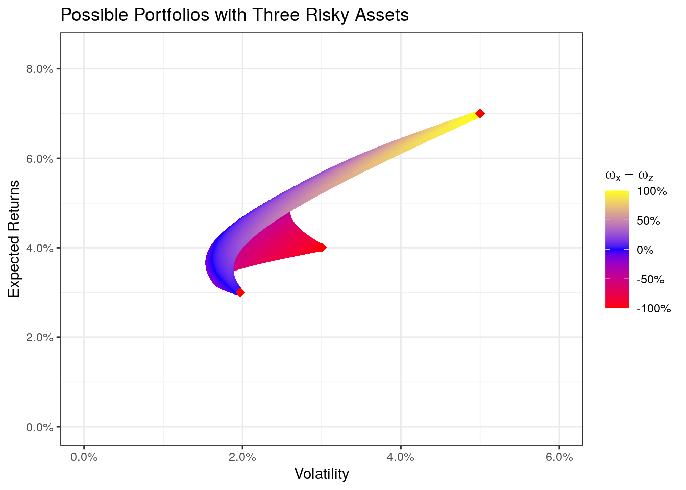
We see that the area of possible portfolios has expanded into a third dimension. The colors try to show the two different weights. A yellow color indicates a portfolio consisting mainly of the asset x, a blue color indicates asset y, and a red area indicates a portfolio of asset z. We also see the three single asset-portfolios (the three red dots). I hope now it also becomes clear what an efficient portfolio is. To give an example: We have many possible portfolios that have a volatility of 2%, but only one of them is a portfolio we would take (the one with the highest expected return) as this is more efficient than the other possible portfolios with a volatility of 2% but with less expected returns. Therefore we call the (upper) edge of all possible portfolios the efficient frontier.
Generally speaking, the expected returns and standard deviations for a portfolio consisting of n-assets are \[ \hat{r}_p = \sum_{i=1}^{n} \omega_i \hat{r}_i \] and \[ \sigma_p = \sum_{i=1}^{n} \omega_i^2 \sigma_i^2 + \sum_{i=1}^{n} \sum_{j=1}^{n} \omega_i \omega_j \sigma_{i, j} \forall i \neq j \]
Calculating the Efficient Frontier
The efficient frontier can be calculated on its own without the need to simulate thousands of portfolios and then finding the efficient ones. We have to distinguish two cases, one with short-selling (that is negative weights) and one without. We will first look at the case without restrictions (with short-selling allowed). So far we have restricted our portfolios to only contain positive weights (by filtering out negative weights).
With Short-Selling
To calculate the efficient frontier we can use the following closed-form formula that calculates the efficient frontier for a given input of risk (the input-value is thus \(\sigma\)) and for some parameters (\(\alpha, \beta, \gamma, \delta\)) using matrix algebra (note, I put the formula here if someone wants to calculate it by hand; if you are just interested in the R code, you can skip the short mathematics section).
\[ \hat{r}_{ef}(\sigma) = \frac{\beta}{\alpha} + \sqrt{\left(\frac{\beta}{\alpha}\right)^2 - \frac{\gamma - \delta * \sigma^2}{\alpha}}, \]
which is the solution to a quadratic optimization problem. The parameters are given by the following matrix algebra
\[ \alpha = 1^T s^{-1} 1, \]
where \(1\) is a matrix of 1’s with a length of the numbers of stocks, \(s\) is a matrix of the covariances between the assets (with a dimension of n times n).
\[ \beta = 1^T s^{-1} \overline{ret}, \]
where \(\overline{ret}\) stands for a vector of average returns for each stock.
\[ \gamma = \overline{ret}^T s^{-1} \overline{ret}, \]
and lastly \(\delta\) is given by
\[ \delta = \alpha \gamma - \beta ^2 \]
As you can see, the only inputs are the returns of stocks, in R we can write a short function (calcEFParams) that calculates the parameters and returns a list with the parameters.
calcEFParams <- function(rets) {
  retbar <- colMeans(rets, na.rm = T)
  covs <- var(rets, na.rm = T) # calculates the covariance of the returns
  invS <- solve(covs)
  i <- matrix(1, nrow = length(retbar))

  alpha <- t(i) %*% invS %*% i
  beta <- t(i) %*% invS %*% retbar
  gamma <- t(retbar) %*% invS %*% retbar
  delta <- alpha * gamma - beta * beta

  retlist <- list(alpha = as.numeric(alpha),
                  beta = as.numeric(beta),
                  gamma = as.numeric(gamma),
                  delta = as.numeric(delta))

  return(retlist)
}

abcds <- calcEFParams(mult_assets)
abcds
## $alpha
## [1] 4037.551
##
## $beta
## [1] 147.8334
##
## $gamma
## [1] 5.992395
##
## $delta
## [1] 2339.881calcEFValues <- function(x, abcd, upper = T) {
alpha <- abcd$alpha
beta <- abcd$beta
gamma <- abcd$gamma
delta <- abcd$delta
if (upper) {
retval <- beta / alpha + sqrt((beta / alpha) ^ 2 - (gamma - delta * x ^ 2) / (alpha))
} else {
retval <- beta / alpha - sqrt((beta / alpha) ^ 2 - (gamma - delta * x ^ 2) / (alpha))
}
return(retval)
}
# calculate the risk-return tradeoff the two assets (for plotting the points)
df_table <- melt(mult_assets)[, .(er = mean(value),
sd = sd(value)), by = variable]
# plot the values
ggplot(df_table, aes(x = sd, y = er)) +
# add the stocks
geom_point(size = 4, color = "red", shape = 18) +
# add the upper efficient frontier
stat_function(fun = calcEFValues, args = list(abcd = abcds, upper = T), n = 10000,
color = "red", size = 1) +
# add the lower "efficient" frontier
stat_function(fun = calcEFValues, args = list(abcd = abcds, upper = F), n = 10000,
color = "blue", size = 1) +
# Miscellaneous Formatting
theme_bw() + ggtitle("Efficient Frontier with Short-Selling") +
xlab("Volatility") + ylab("Expected Returns") +
scale_y_continuous(label = percent, limits = c(0, max(df_table$er) * 1.2)) +
scale_x_continuous(label = percent, limits = c(0, max(df_table$sd) * 1.2))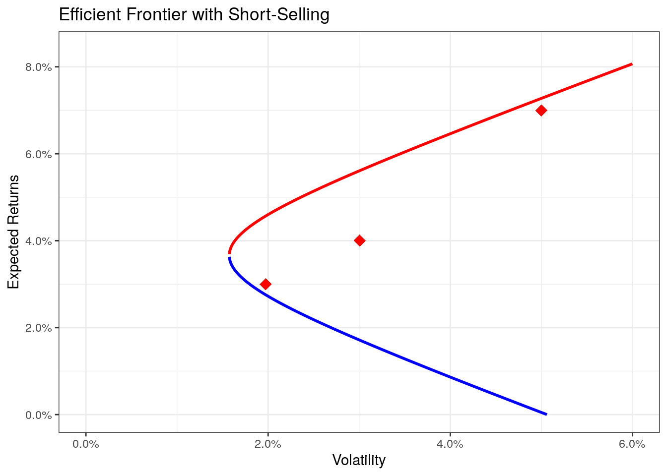
Given the values for \(\alpha\), \(\beta\), \(\gamma\), and \(\delta\) we receive the function for the frontier as
\[ \hat{r}_{ef}(\sigma) = \frac{147.8}{4037.6} \pm \sqrt{\left(\frac{147.8}{4037.6}\right)^2 - \frac{6.0 - 2339.9 * \sigma^2}{4037.6}}. \]
The values for the +-part of the function is the upper, efficient frontier, whereas the --part represents the lower, inefficient frontier.
The red curve (the upper curve) is the real efficient frontier, whereas the lower (blue) curve stands for an inefficient frontier. This is due to the fact, that we can create a mixture of the three assets that has the same volatility but a higher expected return. As we are able to shortsell (borrow money by selling stocks that we don’t own and investing this cash) the efficient frontier doesn’t necessarily touch the three assets, nor does it end at the points but extends outwards.
Although the maths is not trivial (at least when it comes to understanding), the calculation of the efficient frontier is given by a closed mathematical function and its calculation is straightforward. This will change in the next chapter, when we add the restrictions that all weights have to be larger than zero (i.e., no short-selling).
Without Short-Selling
Restricting the portfolio selection by only having positive weights of the assets limits the amounts of possible portfolios and introduces complexity that cannot be handled by closed-form mathematics, thus we need to fall back to mathematical optimization.
There is a wide variety of possible packages that are able to do this, I found the portfolio.optim-function of the tseries-package most useful.
The function takes asset returns, and a desired portfolio return as an input (besides other parameters that we do not use here) and returns information about the portfolio at that desired return. We can write a short wrapper function that gives us the efficient frontier.
library(tseries)

df_table <- melt(mult_assets)[, .(er = mean(value),
                                  sd = sd(value)), by = variable]

er_vals <- seq(from = min(df_table$er),
               to = max(df_table$er),
               length.out = 1000)

# find an optimal portfolio for each possible possible expected return
# (note that the values are explicitly set between the minimum and maximum of
# the expected returns per asset)
sd_vals <- sapply(er_vals, function(er) {
  op <- try(portfolio.optim(as.matrix(mult_assets), er),
            silent = TRUE)
  if (inherits(op, "try-error")) return(NA)
  return(op$ps)
})

plot_dt <- data.table(sd = sd_vals, er = er_vals)
plot_dt <- plot_dt[!is.na(sd)]

# find the lower and the upper frontier
minsd <- min(plot_dt$sd)
minsd_er <- plot_dt[sd == minsd, er]
plot_dt[, efficient := er >= minsd_er]
plot_dt
## sd er efficient
## 1: 0.01965715 0.03004001 FALSE
## 2: 0.01958006 0.03008001 FALSE
## 3: 0.01950373 0.03012002 FALSE
## 4: 0.01942815 0.03016002 FALSE
## 5: 0.01935335 0.03020003 FALSE
## ---
## 994: 0.04965690 0.06976548 TRUE
## 995: 0.04972396 0.06980549 TRUE
## 996: 0.04979104 0.06984550 TRUE
## 997: 0.04985816 0.06988550 TRUE
## 998: 0.04992531 0.06992551 TRUEggplot() +
geom_point(data = plot_dt[efficient == F], aes(x = sd, y = er), size = 0.5, color = "blue") +
geom_point(data = plot_dt[efficient == T], aes(x = sd, y = er), size = 0.5, color = "red") +
geom_point(data = df_table, aes(x = sd, y = er), size = 4, color = "red", shape = 18) +
# Miscellaneous Formatting
theme_bw() + ggtitle("Efficient Frontier without Short-Selling") +
xlab("Volatility") + ylab("Expected Returns") +
scale_y_continuous(label = percent, limits = c(0, max(df_table$er) * 1.2)) +
scale_x_continuous(label = percent, limits = c(0, max(df_table$sd) * 1.2))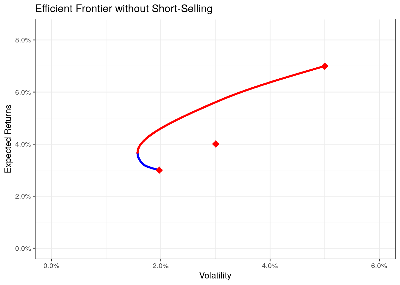
Comparing the two scenarios we see that restricting the weights (prohibiting short-sells), we also restrict the number of possible portfolios. In some cases, restricting short-sells yields portfolios with less expected returns or a higher expected volatility.
To directly compare the two options we can use the following code.
# combine the data into one plotting data.table called "pdat"
# use plot_dt with constraints
pdat1 <- plot_dt[, .(sd, er, type = "wo_short", efficient)]

# calculate the values without constraints
pdat2lower <- data.table(sd = seq(from = 0, to = max(pdat1$sd) * 1.2, length.out = 1000))
pdat2lower[, ':=' (er = calcEFValues(sd, abcds, F),
                   type = "short",
                   efficient = F)]

pdat2upper <- data.table(sd = seq(from = 0, to = max(pdat1$sd) * 1.2, length.out = 1000))
pdat2upper[, ':=' (er = calcEFValues(sd, abcds, T),
                   type = "short",
                   efficient = T)]

pdat <- rbindlist(list(pdat1, pdat2upper, pdat2lower))

# plot the values
ggplot() +
  geom_line(data = pdat, aes(x = sd, y = er, color = type, linetype = efficient), size = 1) +
  geom_point(data = df_table, aes(x = sd, y = er), size = 4, color = "red", shape = 18) +
  # Miscellaneous Formatting
  theme_bw() + ggtitle("Efficient Frontiers") +
  xlab("Volatility") + ylab("Expected Returns") +
  scale_y_continuous(label = percent, limits = c(0, max(df_table$er) * 1.2)) +
  scale_x_continuous(label = percent, limits = c(0, max(df_table$sd) * 1.2)) +
  scale_color_manual(name = "Short-Sells", values = c("red", "blue"), labels = c("Allowed", "Prohibited")) +
  scale_linetype_manual(name = "Efficient", values = c(2, 1))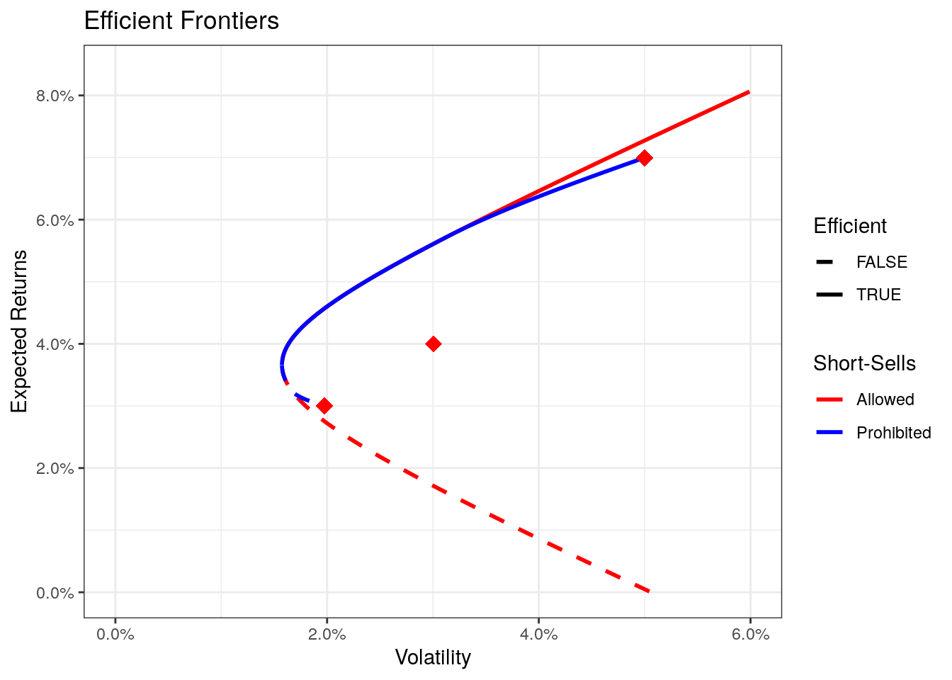
There are many ways to do this and I am certainly not claiming that this is the only option for portfolio selection, but the efficient frontier is a very useful tool to understand one of the basics of finance. The question of which portfolio of the efficient frontier is considered best within the model-frameworks, has to be left open in this part, but will be adressed using CAPM in part II.
This closes the first part of the series. The next section will look more into the CAPM, which is very closely related to the efficient frontier (many would argue that the efficient frontier is part of the CAPM) and its implications, assumptions, and drawbacks. In the meantime, if you have questions, feedback or issues, please leave a comment or write me an email (you find my email in the about-section).
Lastly, if you want to use the graphics or code for your own teaching, please contact me and make sure that you give credit and link back to my blog. Thank you very much. Also as a disclaimer, I am in no way giving any financial advice in this post.
Appendix
One of the many issues I haven’t properly addressed in this entry is the calculation of returns. There are a couple of ways of how to calculate the returns, most often used are arithmetic and logarithmic returns.
Arithmetic Returns \[ r_t = \frac{P_t - P_{t-1}}{P_{t-1}} = \frac{P_t}{P_{t-1}} - 1 \] Logarithmic Returns \[ r_t = log\left(\frac{P_t}{P_{t-1}}\right) = log(P_t) - log(P_{t-1}) \]
The difference between the two is enough to cover another blog post, which is what Pat of PortfolioProbe already did, so if you want to know more about the two, check out his “Tale of Two Returns”.